UI Controls in Chatbot
UI Controls provide a digital experience in chatbots. These can be used to accept some input from the user or represent the information to the user.
You can design the conversation effectively with the help of user interface controls. Here is the list of User Control available:
- Single Select List Buttons (Menu options for single select)
- Multi Select List Buttons (Menu options for multi select)
- Single Select Drop Down
- Multi Select Drop Down
- Date Picker
- Single Value Slider
- Double Value Slider
- Image Card
- Video Card
- Static Carousel
- Dynamic Carousel
- Meeting Control
- File Upload
- Location (Supported for WhatsApp Channel)
- Form Control
Note: UI Controls are available for Web deployment. These are not available on WhatsApp due to the text-only interface. Some controls like list control are converted to text-based menus on WhatsApp.
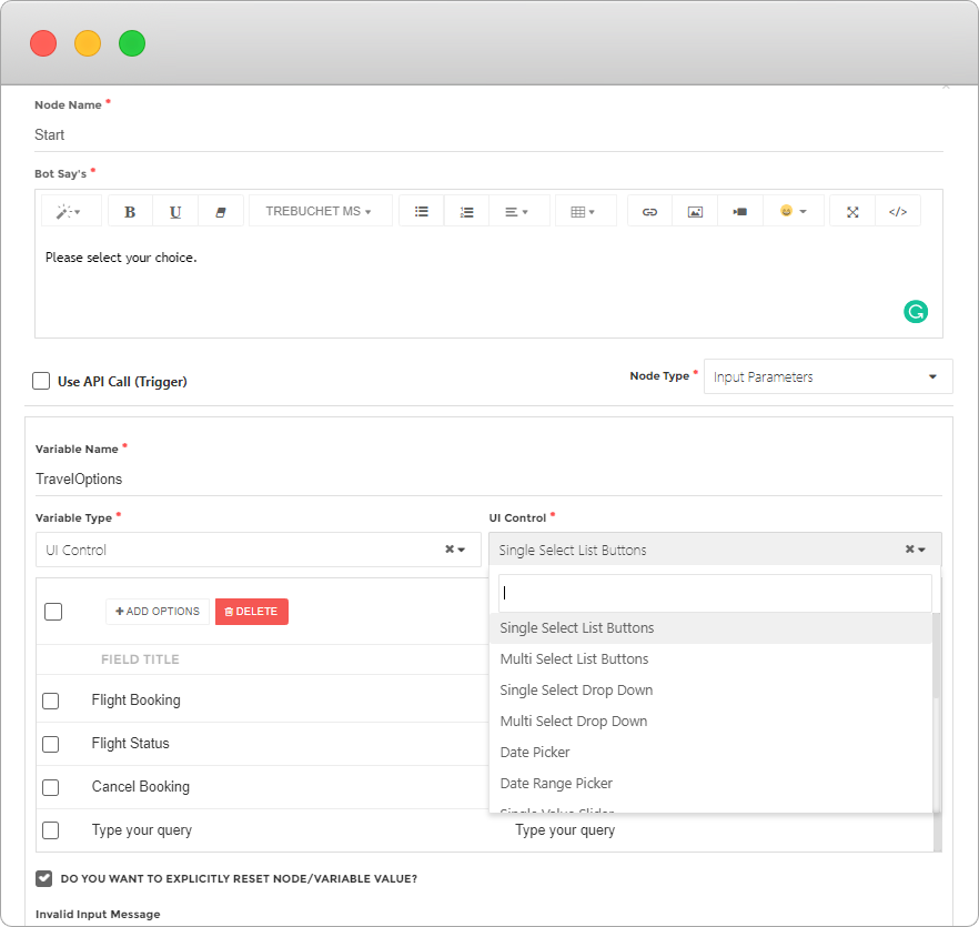
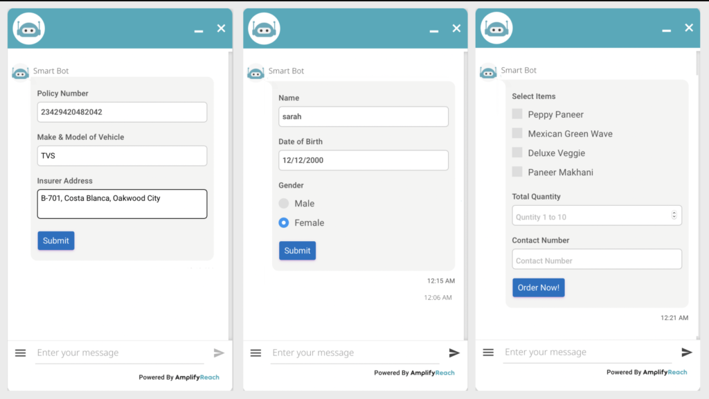
List Control
- The list control is shown to show menu items or lists to the user.
- Users can select one option from the given items.
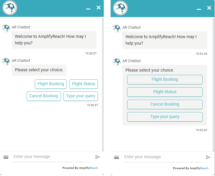
- To use List control select the UI Control type as List (Buttons).
- The default list control is shown vertically. You can select the horizontal option given on the screen.
- Select Add option button to add each menu item.
- The field title is shown to the user, whereas the field value is filled in the input parameter name when the user selects the list item.
- Set variable name that will identify selected option. For example, if the user selects Flight Booking, you can add the condition as
{{TravelOption}} == Flight Booking
Multi select list
- Select the UI Control type as Multi-Select List.
- Set the variable name e.g. var
- Select Add options button to add a check box item.
- The field title is shown to the user, whereas the field value is filled in the variable name when the user selects the list item.
- You can use the value of the selected item as {{var}}. For Example, to check selected item, you can add condition as {{var}} == buy
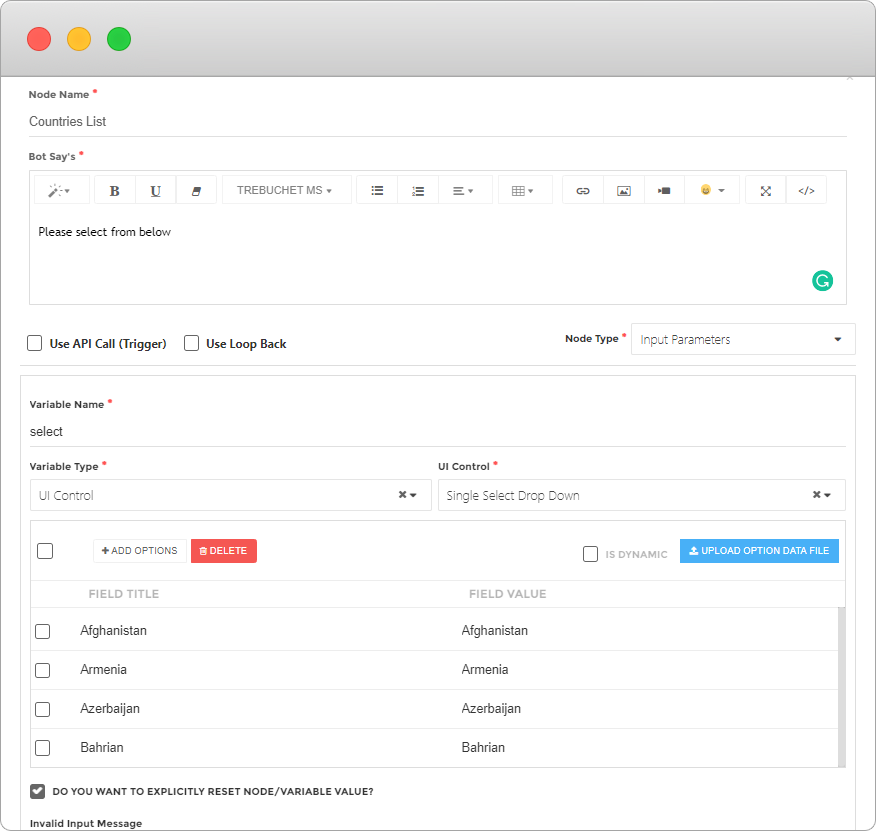
Dropdown List
Sometimes the long list needs to be displayed to the user. For example, a list of countries. Such a long list will be bigger than chatbot height, and may not give a good user experience. In such a case, a single select or multi-select drop-down list can be used.
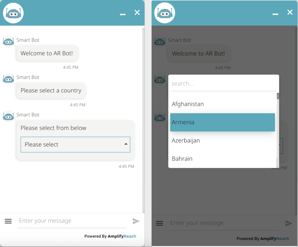
To use drop-down list,
- Select node type as input parameter
- Set variable type as UI control
- Set UI control type as Drop Down list (Single or multiple-select)
- Set the variable name to identify the value selected by the user.
- Use Add Options button to add values to be displayed for the drop-down list.
Date Control
You can use control to accept date from users. You can limit the date range while showing the control. For example, you can block future dates for birth date.

To use the date control,
- Set node type as input parameter
- Set variable type as UI control
- Set UI control type as Date Picker
- Set Date format. This will be used in the variable once the user selects the date.
- You can optionally limit the stat and end date.
- To disable past or future dates, use – or + days or years in the following format. For example in the following screenshot,
Start Date: -15y means, the date control will allow selection for the past 15 years.
End Date: 0d means the user will not be able to select a future date.

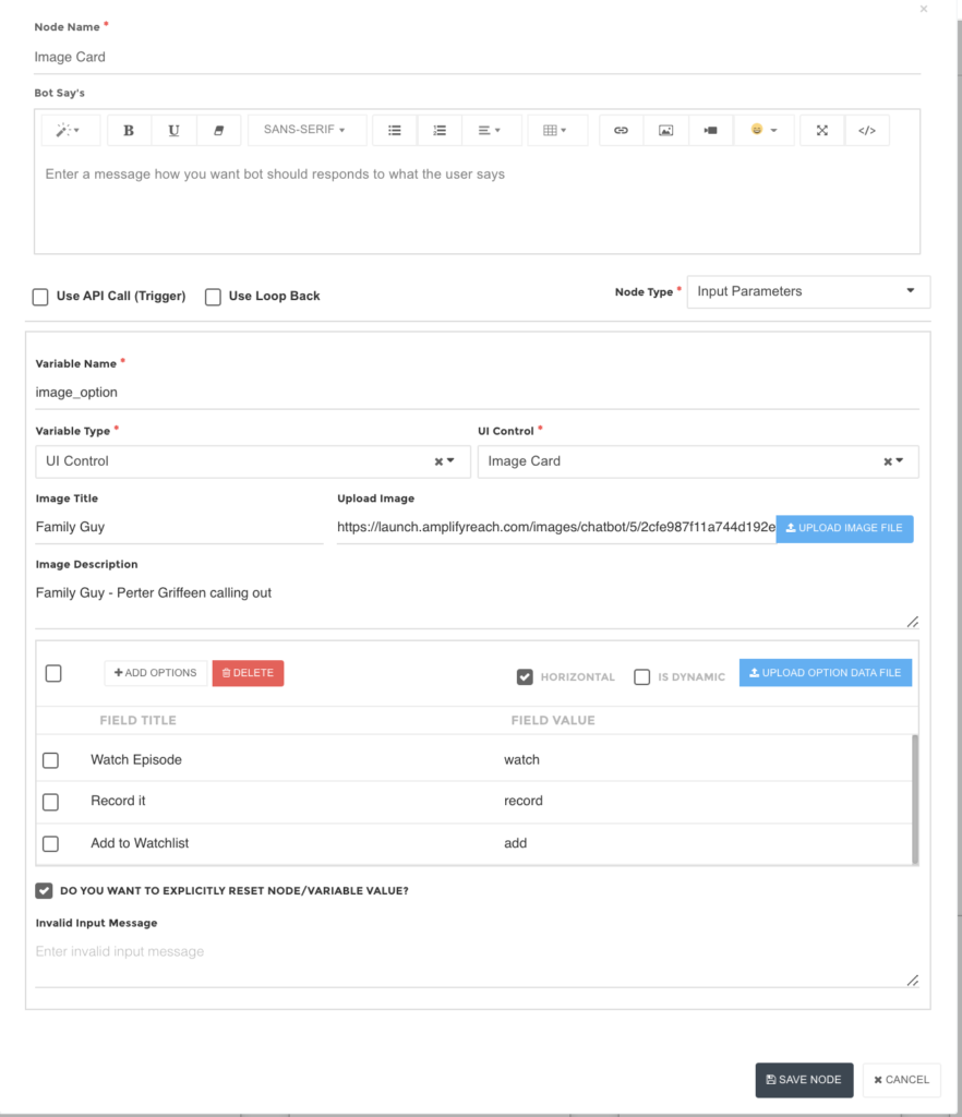
Image Card
An image card is used to show the image and menu options below it.

To use an image card,
1. Select node type as input parameter
2. Set variable type as UI control
3. Set UI control type as Image card
4. Set Image Title and upload the image
5. Use Add options button to add menu options below the image
6. Select type horizontal if you wish to show menus horizontally.
7. Set a variable name for a selected menu option.
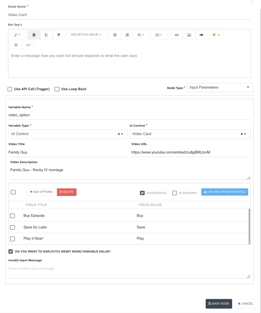
Video Card
A video card is used to show video and menu options below it.

To use a video card,
1. Select node type as input parameter
2. Set variable type as UI control
3. Set UI control type as Video card
4. Set Video Title and Video URL
5. Use Add options button to add menu options below the image
6. Select type horizontal if you wish to show menus horizontally.
7. Set a variable name for a selected menu option.
Static Carousel
A carousel is used to show a collection of images, descriptions and menu options under it. This can be used to display products, descriptions, pricing and different menu options under it. Users can browse through different options using left and right arrows
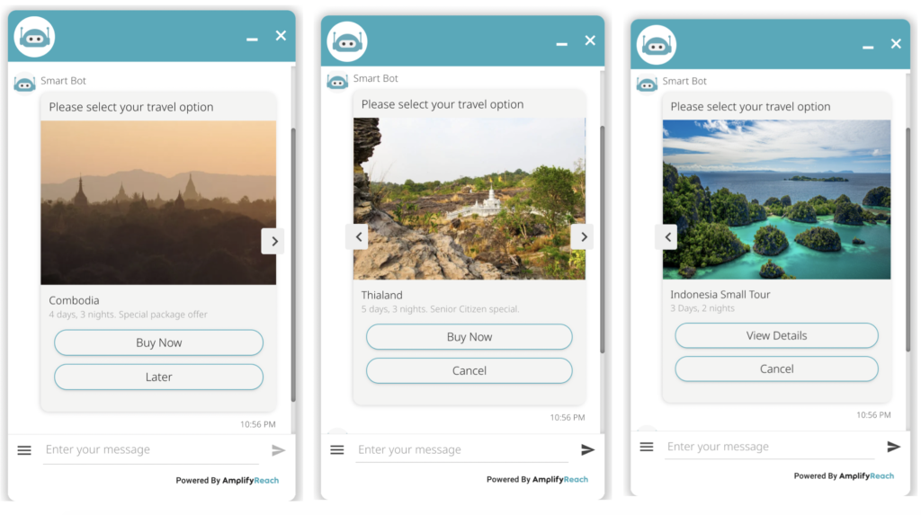
To use image carousel,
1. Select node type as input parameter
2. Set variable type as UI control
3. Set UI control type as Static carousel
4. Set a variable name to identify the action selected by the user.
5. Select template type. Three templates are provided. The template changes the rendering format of the image and description. A preview of information is shown while adding the details.
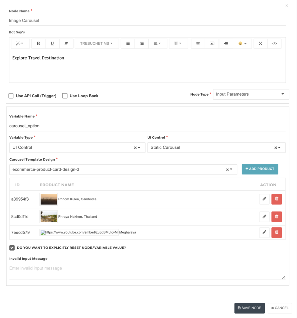
6. Use Add product button to add product details.
7. Copy image URL in IMAGE.
8. You can optionally set name, description, price, currency
9. You can add up to 3 action buttons under the image. You can select a pre-defined button or set the custom name of the action.
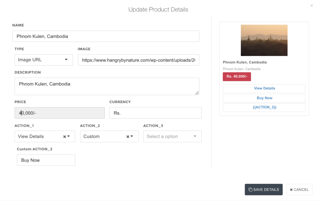
The variable name identifies the action selected by the user. To identify the index of the selected card, use {{var_index}}. Index starts from zero.
For example, in above example if user selected Buy now action on second card, and variable name is set as carousel_option then following values are set.
{{carousel_option}} = Buy now
{{carouse_option_index}} = 1
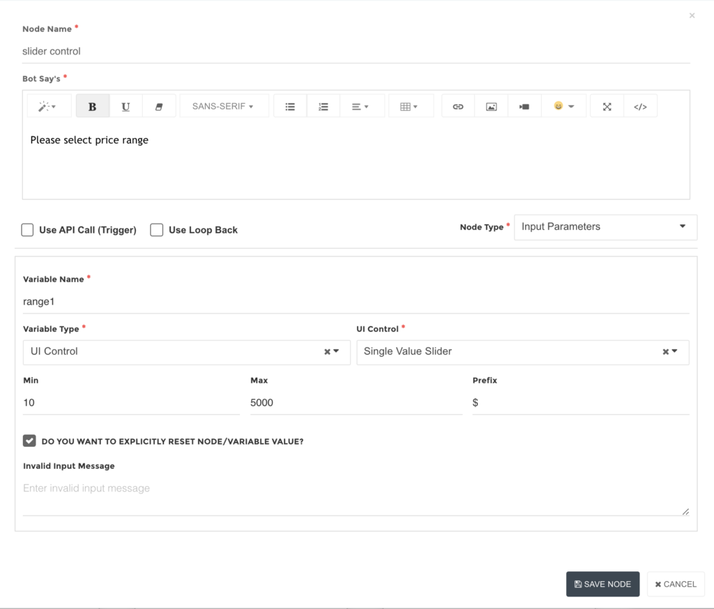
Slider Control
The slider control is used to display a range of numbers.

To use slider control,
1. Select node type as input parameter
2. Set variable type as UI control
3. Set UI control type as Slider Value Slider Control or Double Value slider control as per requirement.
4. Set min and max range.
5. Optionally set a prefix to display with min and max range.
6. Set a variable name to identify the selected range by the user.
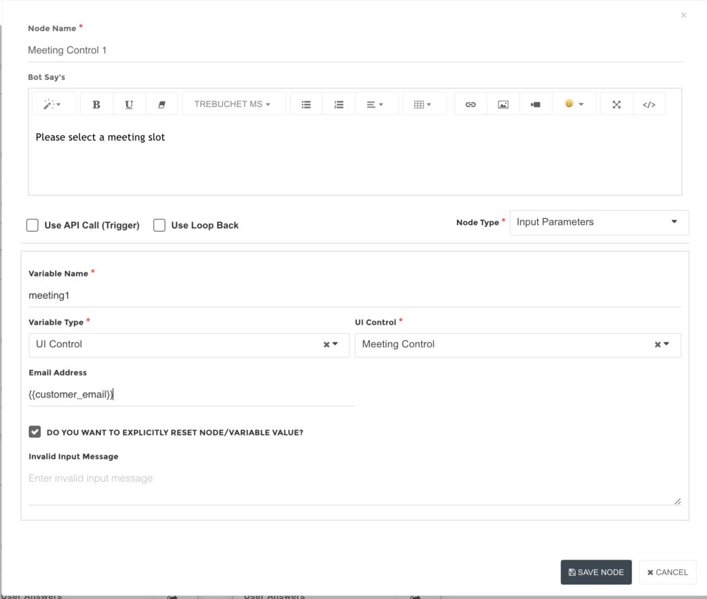
Meeting Control
You can integrate your Gmail or Outlook calendar to set up meetings with customers directly. The bot will show available dates, and free slots on selected dates to book a meeting. Once a slot is confirmed, an invitation email is sent to the customer and agent for a meeting.
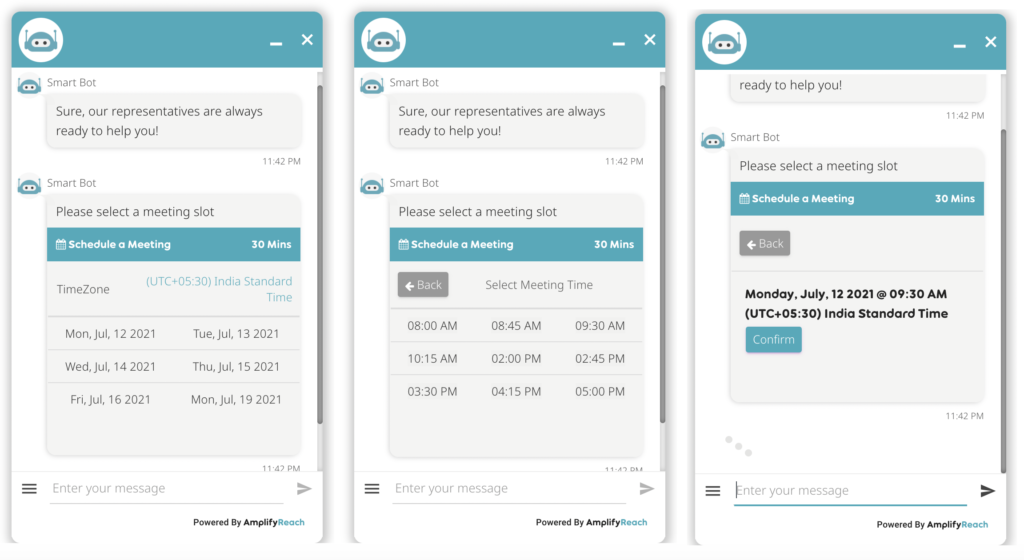
Before using a meeting Control, you need to set up email accounts of agents and their availability in Dashboard -> Meeting Scheduler.
To use meeting control,
1. Select node type as input parameter
2. Set variable type as UI control
3. Set UI control type as Meeting Control.
4. Set customer email in the Email field. This is used to send invitations to the customer.
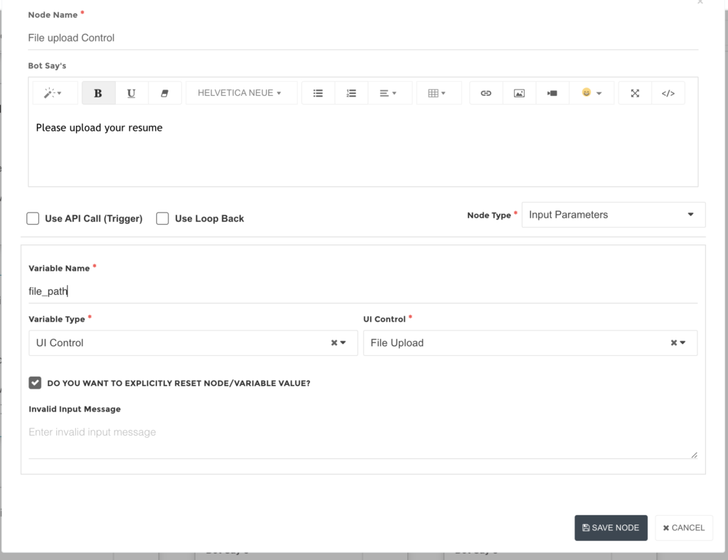
File Upload Control
You can ask the end-users to upload certain documents through the chatbot. For example, a recruitment bot can ask users to upload their resumes.

1. Select node type as input parameter
2. Set variable type as UI control
3. Set UI control type as File Upload
4. Set a variable name to get the path of the file uploaded.
Location (Supported for WhatsApp Channel)
Please contact support@amplifyreach.com to use this control in your bot.
Form Control
You can design a Form control in a chatbot to accept multiple inputs at a time.
Please contact support@amplifyreach.com to use this control in your bot.
Dynamic UI Controls
You can use UI controls to show data coming from API. To know more on using UI controls dynamically please write to support@amplifyreach.com